Shorewood Farmers Market

Branding
Apparel Design
Agency
Three-Headed Design
In collaboration with Three Headed Design, I helped create a new set of logos for Shorewood Farmers Market, located north of Milwaukee on the shores of Lake Michigan.
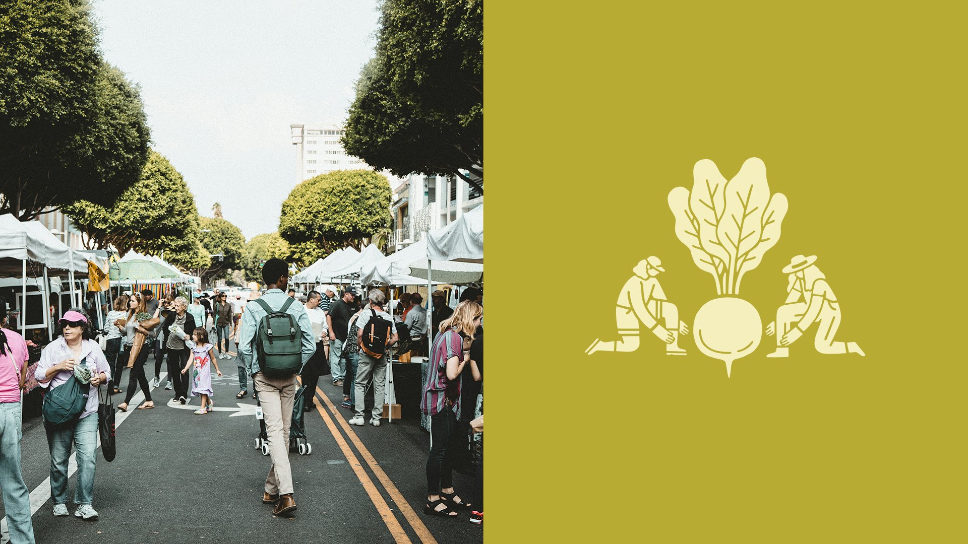
Shorewood Farmers Market is about grabbing a coffee and enjoying a summer day as it’s about the community connecting with local farms. The main logo mark centers around a hand holding a mason jar, which could hold any of the goods you can pick up at the farmers market- honey, coffee, jams and jellies, dry goods, soups, etc. This is also a way for SFM to push sustainable packaging, which has become a core value of the farmers market programming. The flowering pea shoot adds a natural botanical element, and the little bird adds whimsy. We continued to bring a sense of playfulness to the brand with the characters featured in the secondary marks.
Occasionally, I like an unused concept enough to finish it up on my own. This was one of those projects! An early unused direction for the logo was inspired by barn quilts; these are decorative painted panels, inspired by quilt blocks, that are hung on barns in rural America. I really loved working with the juxtaposition of traditional folk imagery and clean minimalistic design.